A DVD or Blu-ray on a shelf acts as a mini-billboard for itself. And just like that ginormous billboard hovering over the freeway, every single aspect of the artwork is intentional (and sometimes even legally required.)
When it comes to physical goods, a title has to speak quickly and clearly to potential purchasers. We aim to strike a balance between the rational and the emotional parts of the human brain, moving from “Hmmm, this looks like something I might like” to “Yes! (adds to cart)” in the space of a few seconds.
At Distribution Solutions, marketing and design professionals are hard at work to blend art and commerce in a way that’s going to drive purchase intent…for the benefit of our label partners. Everyone wins if we get it right!
Striking imagery is the first thing that likely catches a consumer’s eye, but then the box copy gets right to work. Because we only have a few seconds with a customer in a store aisle in an Amazon search, each and every character of the text on a DVD or Blu-ray cover has to pull its weight.
At Distribution Solutions, whether we’re designing the art (or providing feedback), our partners know that each element we include (or suggest) supports the recommendations found during our SWOT analysis of the title.
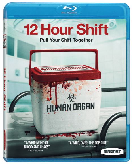
If you’ve been out in the world and seen a DVD before, then you’ll know the key components of key art copy. But we’ll mention them here anyway so that we can elaborate on what each bit of copy brings to the table.
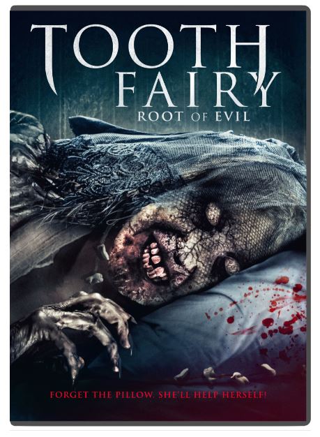
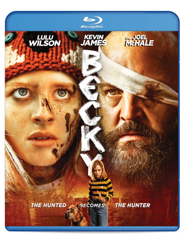
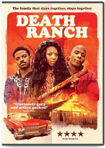
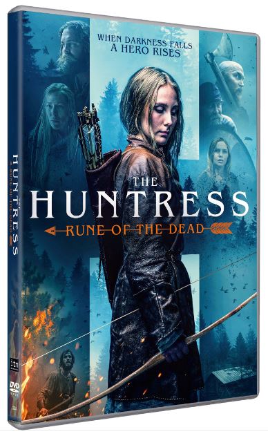
- Title Treatment: Color, typeface, and design convey the film’s genre and tone. Great place to weave in genre iconography or go with a font that evokes a time period.
- Tagline: Adds context and sells the premise of the film. This can be a difficult thing to write. Needs to be concise and as original as possible. (The DS team flat out loves tagline brainstorming, so our partners know they can count on us to get there!)
- Press Quotes: Communicate the critical acclaim and serve as a hallmark of quality, while the sources contextualize who is recommending. With the right set of quotes, a tagline is rendered unnecessary. A great situation!
Our goal is to make the most out of the few seconds our label partners’ titles have with a potential purchaser, whether it be in the aisles of a big-box retailer or a digital storefront during an at-home browse.
To learn more about our process and talk to us about the intersection of art and commerce, drop us a line at studios@ds.aent.com. And one more for the road…